Archive for the ‘New Zealand’ Category

Maps for the celebrity-addicted

Tuesday, October 9th, 2007

We like to think that our technology is being used solely for good rather than evil, but there are some applications where it’s hard to tell. Stalking would be a no-no, but celebrity stalking doesn’t seem so bad. That’s the purpose of the Wellingtonista Celeb Vista group on ZoomIn, which is fully explained in this post on the Wellingtonista.

Simply put, it’s a group for tracking celebrity sightings, but Wellington being Wellington, the celebs being stalked are somewhat more highbrow than on other celebrity-stalking mashups, hence the inclusion of Peter McLeavey along with Bret McKenzie and Shortland Streeters. At least there are no politicians … yet.

INSite

Thursday, September 27th, 2007

IntensCITY week, the celebration of Wellington’s urban spaces, is just about to kick off. A key part of the week is the INSite exhibition, which consists of eight shipping containers distributed around the city as artists’ spaces and installations. Here’s a ZoomIn group to show their locations (or you can go directly to the group map on ZoomIn).

As these are ZoomIn places, you can of course add your own photos and comments and edit the descriptions. I’ve kicked that process off, but if you manage to get some good photos or have some responses you want to share, please go ahead and do so.

Congrats to PlanHQ and Ponoko on being techcrunched

Wednesday, September 26th, 2007

Hot off the heels of Ponoko being at the techcrunch 40 , PlanHQ have just been techcrunched.

Congrats to Dave, Tim and the teams at Ponoko and PlanHQ

Silicon Welly represent !

Barcamp slides

Monday, September 17th, 2007


Here are the slides from our talks at Bar camp.

John & Paul on “Why your website is SLOW and how you can make it fast!” – John’s slides in PDF (2.2Mb) and Paul’s slides in PDF (87K )

Tom on “Space, Place and the meaning of Where” – (Powerpoint 7.5Mb and Openoffice 7Mb)

We had a great time talking to everyone and putting faces to some famous bloggers.

Kudos to both Mike’s, Nat and Fronde staff for putting on a fantastic event!

Telstra entering the Mobile market soon.

Wednesday, August 22nd, 2007

With all the recent discussions on Rod’s blog about Mobile pricing, some respite may soon be on the way. Telstra Clear have publically announced that they are launching soon. Hooray, hopefully we’ll get some competition.

Here’s what I’d like to see.

  • Hygiene factors: Good Coverage, good quality sound and sim card compatibility, good customer service, and a good website so that I can customise what I need.
  • Flat SMS rates 5c max for both Domestic and International ($10 txt has been out for years – Stop bundling and just set a lower cost.)
  • Realistic pricing structure for SMS services – 5-7% royalty based on volume
  • Data bundles $25 for 1Gb or $1 per 10 Mb adhoc
  • Release Cell Tower ID’s so that we can unlock the world of location based services

What do you want to have from your Mobile provider?

Battle for the "Blediscode" Cup

Friday, August 17th, 2007

Tomorrow, the Codeblacks battle for glory against the Australian team (webabies???) in the full code press. (This challenge should be called the “Blediscode Cup”)

Zef is over covering the action. Hopefully, he’ll be using the traditional commentary, “Full credit to…” and “It was a website of two halves…”

The big question is will they be doing the haka before kick-off ? And what will be the Australian reply???

There’s a lot of coverage on the web, Youtube , flickr , the official blog, codeblacks blog and the WIPA blog.

Go the Codeblacks, do us proud.

Smaps – 1 year old today

Friday, July 27th, 2007

smaps1.jpg

Customer behaviour on eBay => tips for Trade Me users

Tuesday, July 24th, 2007

Seth Godin has just posted about an article on Customer Behaviour on eBay.

Key findings:

  • More than 43% of people bid more than the “Buy Now” price.
  • Buyers are attracted to lower start prices. (Even when shipping is extra.)
  • Bidding strategy is mixed, timing is key to get final bids for an auction.

I would like to add some basic observations from my previous auction experiences:

  • Looking for bargains, search for “mis-spelled” items. Sometimes you’ll get get a bargain as people can’t find it.
  • Do some research on your sellers. High ratings doesn’t necessarily mean good service.
  • If a seller is using western union as a payment then its a scam.
  • If you’re unsure about the seller, use safe trader or paypal.

Three in one

Tuesday, July 3rd, 2007

One of the things that we’re always trying to do with data visualisation is show more variables, while trying at the same time not to clutter the map and overwhelm the viewer. When trying to show more than one variable across a map, it rapidly becomes impossible to grasp the information in one go. Edward Tufte, on page 153 of his classic book “The Visual Display of Quantitative Information”, describes one such attempt to map two variables through interaction of two colour schemes as “a puzzle graphic”, “experienced verbally, not visually”.

But that doesn’t mean that it’s not worth the effort. The distribution and interaction of two variables across a region is inherently complex, and to expect every nuance to immediately leap out at a viewer without reflection and complex analysis is unrealistic. My experience of reading professional weather maps that show multiple overlapping contours (e.g. of pressure and temperature) leads me to believe that any multivariate geographical visualisation will require some practice to get the most out of: to learn that where the isobars and isotherms are perpendicular, thermal advection is occurring.

If two variables are too much for Tufte, then the map below would appal him: I’m experimenting with showing three census variables at once on a map of central Wellington. I’ve mapped residential population density to the red channel, density of office workers to the blue channel, and density of other workers (e.g. manufacturing, retail) to green.

Trivariate mosaic visualisation - Central Wellington

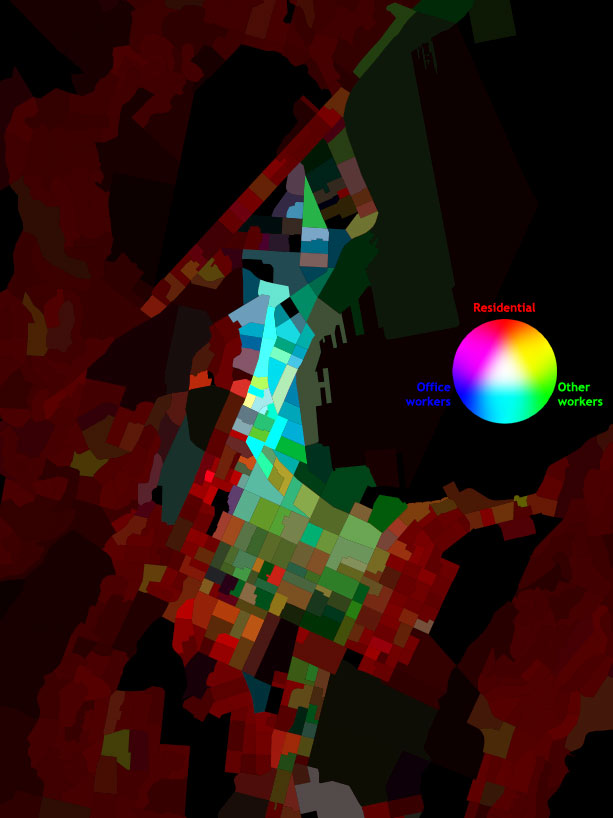
It’s certainly complicated! But nevertheless, certain patterns do immediately leap out, and the more I look, the more I see. Purely residential neighbourhoods are quite distinctive in shades of pure red, and variations of population density can be seen quite clearly. The CBD stands out very plainly, but on second glance there’s also a difference between the Lambton Quarter and Thorndon: the cyans of the former show that office workers are balanced by others (probably retail), whereas the latter is much more of an office ghetto. Te Aro is quite a patchwork of greens and earthy tones, showing that a growing residential population is starting to complement the retail, entertainment and tradition light industrial uses of that part of town.

So, while bearing in mind Tufte’s warnings, I think that this sort of trivariate thematic mapping might have a lot to offer. In particular:

  • High data density: three separate variables across densely measured meshblocks.
  • Emergent patterns: without having to explicitly code “mixed use districts” or “CBDs”, they emerge from the interaction of two or more variables.
  • A meaningful grid: census meshblocks are mostly based upon city blocks, so variations in urban form, such as the grid pattern of Te Aro versus the curvy hill suburbs, are easily visible. The familiar forms (at least to locals!) of the wharves guide the eye without explicit use of contextual layers.
  • Exploiting human visual processes. While I’d concede Tufte’s point that one has to consciously remind oneself of what certain colours mean, the fact that the RGB system has a neural reality makes it easier than a more arbitrary system would have done.
  • Metaphorical power: I deliberately chose to make light colours represent high density and black represent an absence of people, which is the inverse of the usual approach. That gives a map full of neon colours, evocative of “city lights”, and fits with my own preference for dense and vibrant cities. It also brings to mind a mosaic, with its connotations of colourful diversity. As always, symbology reveals ideology!
  • Visual appeal. Well, at least I like to think it looks good! While it wasn’t deliberate or expected, I think it’s ended up quite reminiscent of early Paul Klee.
  • Depth of exploration. While the two previous points may seem relatively trivial, a map that is attractive and evocative is more likely to bring people back to explore further than an ugly or dull map would. Every time I look, I keep finding more patterns and intriguing anomalies, and it keeps raising new questions to ask of the data.

Mapping it right

Tuesday, July 3rd, 2007

While I may be a fan of the “intuitive” and “idiosyncratic” nature of neogeography, we all recognise the importance of getting the core geographic information right. We’re about to start a comprehensive update of all our mapping tiles, and while we were able to get out a relatively quick fix for the Wellington bypass, it will take a bit of effort to do it properly for the whole country.

While we pay good money for our base data, it’s a fact of life that nothing’s perfect, and the physical world sometimes moves too fast for surveyors, councils and data providers to keep up with. We already have a list of updates and corrections that we’ll probably have to make manually, and we’ve had useful reports from ZoomIn users that we’ve added to the list. But we want to ask you, our blog readers, whether you’ve noticed any errors, out-of-date areas or places that could do with a tweak.

Along with that, I’d like to know if there are any improvements we could make to the appearance of our maps. As just one example, as a supporter of pedestrian-friendly cities it has always seemed odd to me that pedestrian streets like Cuba Mall have the same symbology as dirt tracks through the bush. There’s a field in the raw data that distinguishes “malls” from walkways, and if I get the chance I’d like to represent the difference visually. Are there any visual quirks or infelicities that you’d like us to take a look at?

We can’t guarantee that we’ll get every suggestion into the upcoming map release, but we’re keen to get your feedback on what would make our maps the best they can be.


http://www.canakkaleruhu.org http://www.vergimevzuati.org http://www.finansaldenetci.com http://www.securityweb.org http://www.siyamiozkan.org http://www.fatmaozkan.com http://www.sgk.biz.tr http://www.denetci.gen.tr http://www.bagimsizdenetim.biz.tr http://www.mevzuat.biz.tr http://www.security.biz.tr http://www.sorgulatr.com http://www.kanunlar.biz http://www.prsorgu.net http://www.sirabul.com http://www.emekliol.org http://www.coklupagerank.com http://www.coklupagerank.net http://www.coklupagerank.org http://www.prsorgu.org http://www.scriptencode.com http://www.sirabul.net http://www.sirabul.org http://www.sitenizanaliz.com http://www.seoisko.com http://www.seomavi.com http://www.scriptencode.net http://www.scriptencode.org